
It appears that we are in the middle of a global pandemic. COVID-19, caused by the SARS-CoV2 Virus (a form of Coronavirus) is spreading rapidly throughout the world. Some estimates suggest that more than half the world’s population will become infected over the next two years or so. This is serious: COVID-19 appears to be both more contagious and more deadly than most influenza strains, and it appears to be particularly dangerous for older people. While it’s important to note that these estimates are based on emerging and incomplete data, epidemiology is a fairly well developed science with strong methods for calculating these sorts of figures.
So, what can we do? Wash your hands. Cough and sneeze into your elbow. Stay home if you have symptoms. Cancel travel plans and avoid crowds and large gatherings.
I’ve noticed that a point of confusion sometimes arises here. If COVID-19 is already a pandemic, if its spread can’t be stopped, then what’s the point? Aren’t we all going to get infected anyway? Might as well get it over with, right? Especially if you’re young and not in a high-risk category, you might not see the point. In my Twitter feed, the point has been hammered repeatedly: flatten the curve. This figure by Esther Kim and Carl Bergstrom illustrates the meaning.
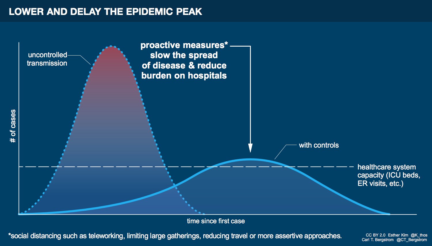
The left curve is the spread of the disease without interventions. People don’t wash their hands and don’t avoid travel and large gatherings. The disease spreads quickly. So many people are infected at once that hospitals and other healthcare systems are completely overwhelmed. This escalates infection and leads to more deaths among the infected, as well as among those who need care for unrelated illnesses and medical conditions. The right curve is the spread of the disease with interventions. A similar number of people still get infected, but the spread is sufficiently slowed that the number of people infected at a given time is much smaller, hopefully within the capacity of our healthcare systems. Flattening the curve has two major benefits. First, hospitals and other providers are able to handle the number of infected individuals at any given time. And second, there is more time for additional treatments to be developed and tested. Both of these things save lives. We need to flatten the curve.
I think that most people understand the benefits of behaviors like washing your hands and covering your mouth when you sneeze. After all, these are behaviors that help prevent you from getting sick or infecting others. But from talking to some people, it’s not always clear to everyone exactly how collective behaviors like avoiding crowds or canceling travel translates to slowing the spread of disease at the population level. In fact, these things are critically important. I wrote up this post in an attempt to illustrate why.
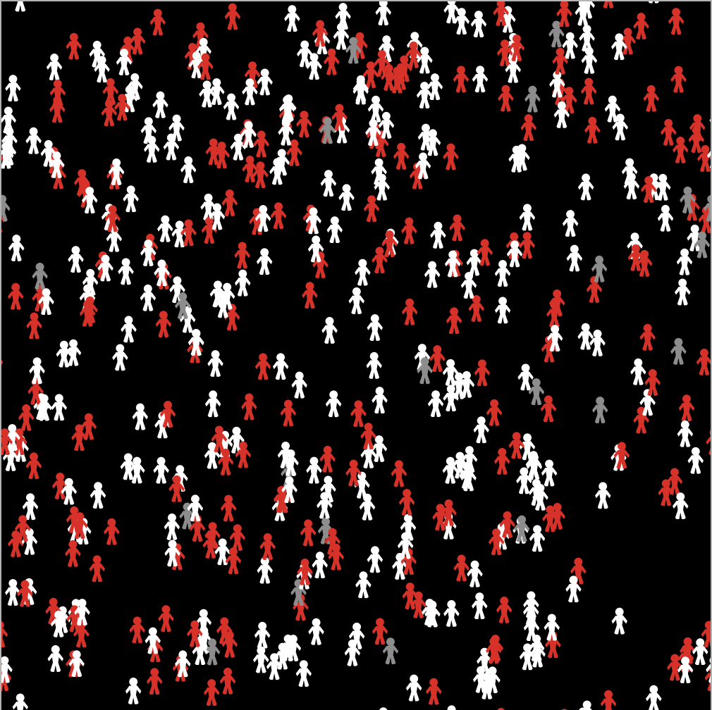
I teach a class at UC Merced called “Modeling Social Behavior.” And because of that class, I had at the ready a simple model of disease spread. It belongs to a family of models called “SIR models,” where the letters stand for Susceptible (meaning that you are uninfected but susceptible to the disease), Infected (meaning that you are both infected and contagious), and Recovered (meaning that you have either recovered from the illness and are neither susceptible nor contagious, or that you have otherwise been removed from the population). In this model, people (sometimes called “agents”) are situated in and move around on an abstract two-dimensional space. Anytime a susceptible individual is sufficiently close to an infected individual, they become infected with some probability (the transmission rate). An infected individual then recovers with a probability dictated by the disease’s recovery rate. The population looks like this. There are 500 agents. The white ones are susceptible, the red ones are infected, and the grey ones are recovered.
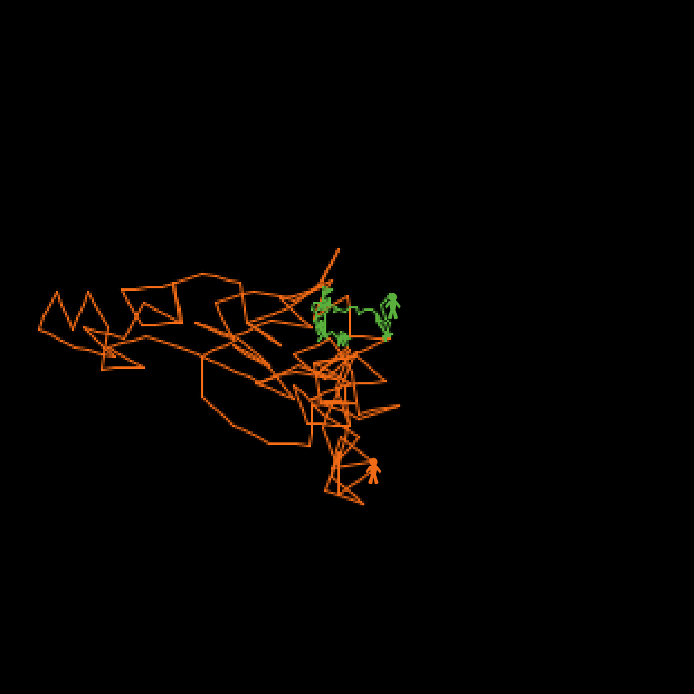
The model is not specific to COVID-19, and ignores aspects like incubation periods. I purposefully did not try to calibrate the transmission or recover rates to COVID-19. You should think about this as a generic model of disease transmission. The model parameter I want to focus on is one related to the agents’ mobility. At each tick of the model’s clock, each agent chooses a random direction to face and takes a step, which allows the agents to mix with each other. In other words, agent movement is just a random walk through space. By controlling the size of the step agents take on each movement, we can control the extent to which they move through social space, and thus the extent of social mixing. Here’s an example with two agents, both of which started in the exact center of the space and took 100 steps, with a line drawn between each location at each tick of the clock. The green agent takes small steps (of size 0.5 units – the entire grid is 51 x 51 units square). The orange agent takes large steps (of size 3 units). As you can see, the orange agent has covered substantially more ground than the green agent in the same amount of time. A population of orange agents, who widely explore their social space, will encounter far more unique individuals in a given time than a comparable population of green agents, who move narrowly and tend to interact with the same individuals over and over.
Whether agents move widely or narrowly in space can dramatically affect the dynamics of disease transmission. I started with a population of 500 uninfected agents and infected three of them at random. I then tracked the number of agents who were infected over time. Here are the results from simulations with narrowly (green) and widely (orange) mobile agents, defined as above as agents with a step size of either 0.5 or 3.0 units, respectively.
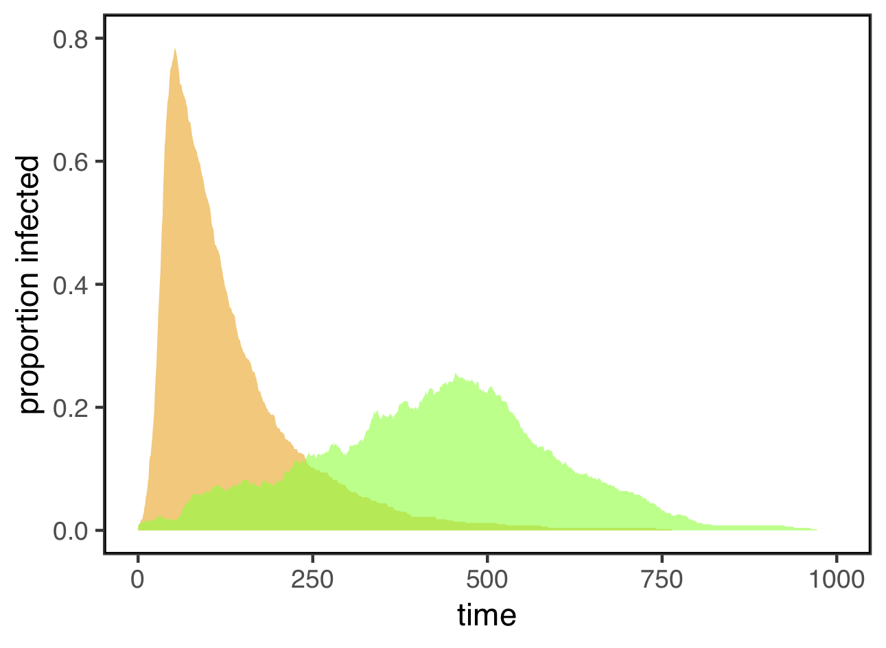
These look an awful lot like the “flatten the curve” figure at the top of this post! When agents move widely, the disease spreads very fast, and lots of them are infected at the same time. For this simulation, the maximum infection rate for widely mobile agents was 78%. For the exact same disease, with the same transmission rate and recovery rate, restricting agents to narrow mobility not only stretched out the time course of the epidemic, it also substantially reduced the maximum infection rate to only 25.6% — less than a third of what it was under widely mobile agents.
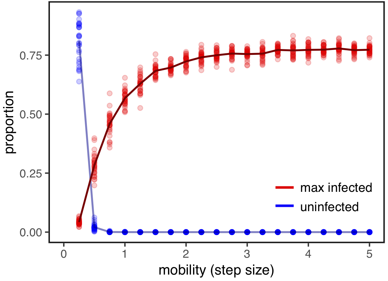
Here, I’ve plotted the maximum infection rates for a range of step sizes, running 30 simulations for each value. These are shown in red (the line connects the means for each step size). I’ve also plotted the proportion of individuals who never become infected over the course of the epidemic (in blue). Note that while this number is positive for very small step sizes (perhaps representing rapid and effective quarantines), it quickly goes to zero, meaning that everyone eventually becomes infected. But this figure also shows that even if everyone becomes infected eventually, reducing mobility and population mixing—by limiting travel and avoiding large gatherings—can dramatically reduce the number of people who are infected at any given time.
The code to run the model and explore it on your own is available here.The model was made with NetLogo, which you can download for free here. You can also upload the model to NetLogoWeb and launch it in your browser window without installing NetLogo on your computer.
UPDATE: You can now access a version of the model that you can run directly in your browser here.